There is a myth that innovation just happens, that it’s a spark of genius that comes upon you when you least expect it. Whilst this can be true, the majority of innovation comes from hard work. Hard work understanding a problem, hard work making the conditions right for innovation, hard work coming up with ideas, hard work testing them, hard work trying and failing and trying again. Many times even hard work isn’t enough but what can sometimes make the difference is an understanding of how innovation works and having the knowledge, tools and techniques to help it along. This post isn’t going to teach you how to innovate but it does touch one technique that can sometimes help.
Related worlds
When I went to innovation school (ok a few days worth of lessons and sessions) I learn a number of techniques for coming up with ideas that might lead to a new solution for your problem. One of these techniques is call “Related worlds”. One example of Related Worlds (and the hard work required in innovation) is the James Dyson story
In 1978, James Dyson became frustrated with his vacuum cleaner’s diminishing performance. Taking it apart, he discovered that its bag was clogging with dust, causing suction to drop. He’d recently built an industrial cyclone tower for his factory that separated paint particles from the air using centrifugal force. But could the same principle work in a vacuum cleaner?
At the time the ‘cyclone’ belonged in a different ‘world’ from domestic hoovers, they belonged in large industrial factories with machinery that filled workshops and had nothing to do with the household appliance that cleans the floor. However, what Dyson did is notice that these different “worlds” had a common problem and the rest is history. Another lovely example of a successful application of “Related Worlds” is Great Ormond Street working with Formula 1 teams to speed up patient handover to save lives .
Our problem
As more models, experiments and forecasts take advantage of the Met Office’s increased super computing power there is evermore data to be explored and analysed the it’s becoming clear that the tools to do that aren’t always up to the job. One of the difficulty of visualising atmospheric data is that it’s almost always multi dimensional usually having at least four dimensions (latitude, longitude, height and time). Whilst this is a knotty problem it’s not entirely unique and one of the Related Worlds that really caught my eye was medical imaging.
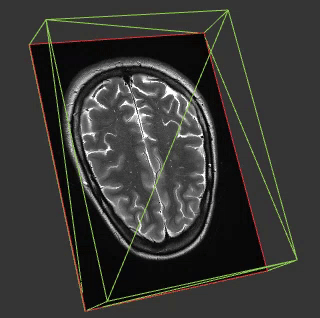
Medial imaging is frequently in 3 or 4D and so many of the techniques in this field might be applicable in ours. Another interesting aspect of most medical imaging is that on the whole the things you are visualising are opaque. This is interesting because whilst you can do some great stuff visualising fields like cloud fraction in 4D by mimicking what our eyes would see this doesn’t work when you come to a property such as wind speed which is a) invisible and b) everywhere.
Prototypes
To build the prototypes below I used the excellent AMI Medical Imaging (AMI) JS ToolKit for THREEJS. I created a fork in GitHub in order to implement my own parser and loader and tweak some examples to use weather images.
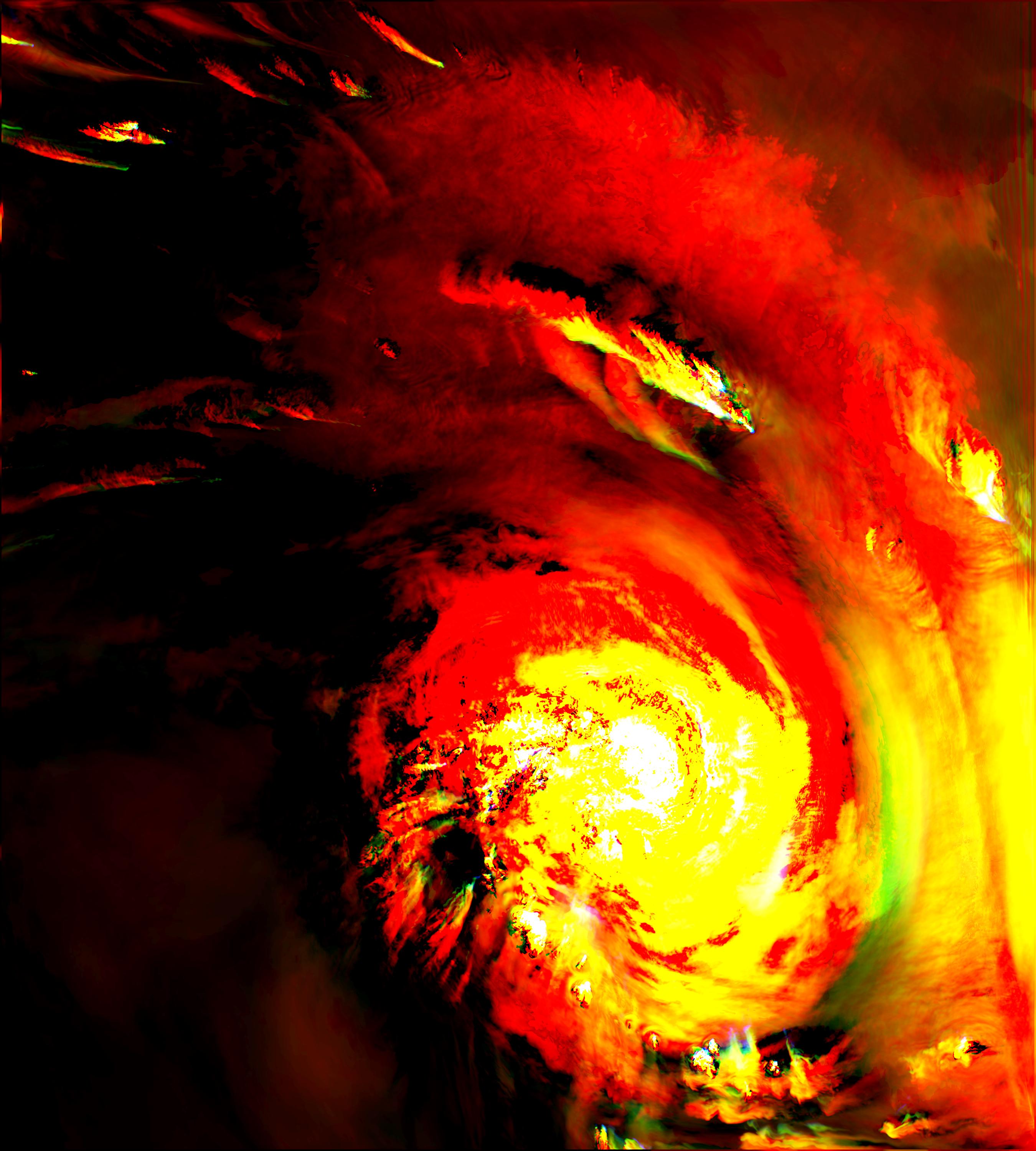
One of the things I was keen to test was how much data we could visualise, if you want to run the first of these visualisations you’ll need to be a modern browser and a little patience (a minute or two to load). The reason for this is because the original data set is at a latitude, longitude resolution of 6000 x 5400. For these visualisations I’ve had to half that so that’s 3000 * 2700 ~ 8 million data points per level. The visualisations have 60 levels in them (the original data set has 80) so we are now up to 8M * 60 = 480 million data points. Each point starts life as a float 64 so 480M * 8 (float 64 = 64 bits = 8 bytes) ~ 4GB.
So what we are looking at is about 4GB of data. In order to get that into the browser in a timely-ish manor we compress that by converting the data in to JPGs using the three channels (red, green, blue) each as a different model level. The input images (20 of them) containing the data to visualise look like this:
For more information on this compression technique read the paper we’ve wrote about it.
Once we’ve got this data in the AMI JS ToolKit we can visualise is using using a volume rendering approach:
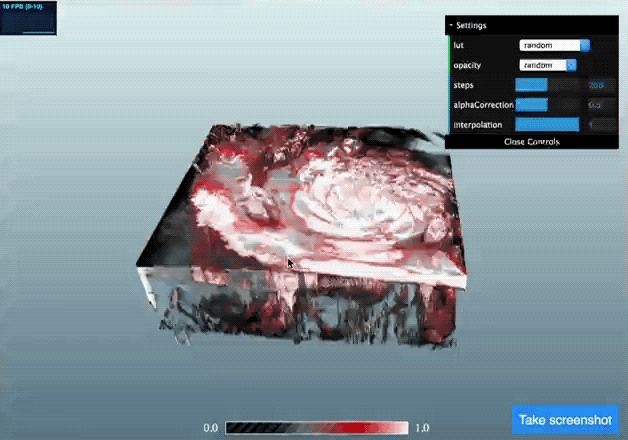
(click the image to go to a live demo but be patient for one to three minutes whilst it loads)
Alternatively it can be visualised by looking at cross-sections through the data. This approach might work particularly well for data like temperature or windspeed which you can’t visualise in the way you would actually see it. The example below shows taking three orthogonal cross-sections and using these to interrogate the data.
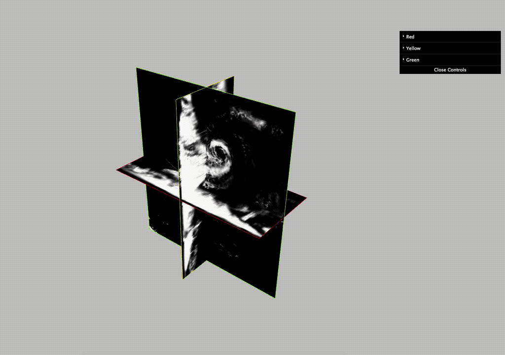
(again click the image to go to a live demo. There is 100 times less data in this example so it should run much more smoothly)
What’s next
There are loads of things I’d like to look at with this project but might not find the time for such as if Web Workers could be used to parallelise the processing of the images in a non UI blocking way, or introducing colour to provide more informative data interrogation tools. Whilst these and other experiments would be really interesting what I will be doing first is working with the scientists at the Met Office who are producing the next generation weather model to try provide the visualisation tools they need to test and explore their work.
Thanks
A big thank you to you for reading and to @nico on the FNNDSC Slack channel for all his help with AMI Medical Imaging .